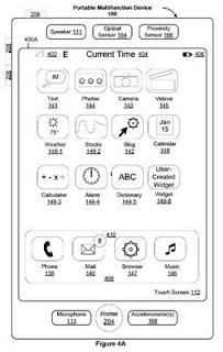
In their patent application for the iPhone, it is interesting to see the sketch from Apple that shows the interface. It is very clear that it is the iPhone as we know it, even though it is a very simple sketch without any efforts made to make the appearance aestheticlly pleasing. For interaction designers there is a lesson to be learned here about the relationships between ideas and manifestations, between sketches and final designs. Almost anyone could have made this sketch of the iPhone with the purpose to portray the ideas. This is comforting for those of you who are afraid that you do not have enough visual skills. If you can do this, you can then get help from someone to make this into a full and beautiful deisgn.


4 comments:
We should not forget that the visual 'styling' or graphic treatment is very important, especially to apple. It would be a shame to see a wireframe sketch like this taken atthe last minute to be 'skinned' in order to make it more pleasing. And I'm sure apple put a ok of time and effort into developing such an aesthetic both in the visual treatment in order to bring a cohesive slickness not just for the purposes of appeal, but for making things more understandable. Both these approaches should be done together through a collaborative sketching process to shape visions of the whole. Sorry about the terrible writing, I'm typing this on an iPhone myself!
Hi Miek
I completely agree with you. I tried to make a point about sketching only, not about the full design process where of course the aesthetics and detailed design is a crucial part of the quality of the final composition. Thanks for taking the time to enter all this on an iPhone :-)
Erik
This doesn't necessarily lessen your point, but patent drawings are made to a specific standard, so I wouldn't assume that this drawing actually came out of the design process. More likely it was drawn in this form by a patent attorney. (But again, I think your point is still a good one.)
It makes a little sense spending much time developing design concepts which tend to be very large in number. The whole idea is to generate a lot of concepts quickly and finally to integrate the best features from each.
Moreover such raw wireframes act as a bridge between the visually less skilled people who might have brilliant ideas and the ones capable of producing a good visual design derived from the former ideas.
Post a Comment